
In this article, we are going to explore the Different kinds of Image hover effects using CSS filters (grayscale, blur) and CSS3 scale method of transform property. By using grayscale filter we can create the black – white image hover effect and By using blur filter we can create the blurred image hover effect.
By using scale method of transform property, we can create the zoomIn – zoomOut image hover effect.
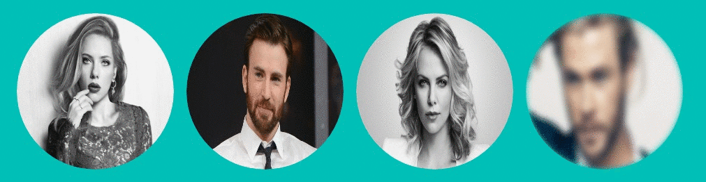
Circular Image hover effects are the very nice way to display the author pictures at the end of the blog posts in the articles with different effects.
The different effects we are going to see in this Demo is achieved by using CSS filter methods and CSS3 scale method of transform property.
let’s start coding
- First, Consider a div with
id:wrapperand inside it consider a twelve div elements with sameclass:image-holderand inside the each div element consider an image with different classes, For first three images setclassasimg-1, for the next three images set theclassasimg-2, next three withimg-3and last three withimg-4. very soon you will come to know the reason behind the usage of the different classes. - Now style the parent div element with
id:wrapperby setting itswidthto700px,paddingto10px,marginto20px autoto make the content lie at the center of the browser andoverflowtohiddenso that the extra content lies inside the div element.#wrapper { width: 700px; padding: 10px; box-sizing: border-box; margin: 20px auto; overflow: hidden; } - Now style the div elements with
class:image-holderby setting itswidthandheightto200pxandfloattoleftandoverflowtohiddenso that, image don’t get overflow from the div in zoom-in-zoom-out effect. and set theborder-radiusto50%to get the circular/rounded effect..image-holder { width: 200px; height: 200px; margin: 8px; float: left; cursor: pointer; border-radius: 50%; overflow: hidden; } - Now set the image
widthandheightto100%andborder-radiusto50%.image-holder img { width: 100%; height: 100%; border-radius: 50%; }
To achieve the Black-White Image hover effect
- Style all images with
class:img-1by setting itsgrayscalemethod value to1and so that all images withclass:img-1turns into the Black color. and add the transition property for the smooth effect..image-holder .img-1 { filter: grayscale(1); transition: 0.5s ease-in-out; } - Now on hover, all the images with
class:img-1should turn into the color, to achieve this effect set thegrayscalemethod value to0.image-holder:hover .img-1 { filter: grayscale(0); transition: 0.5s ease-in-out; }
To achieve ZoomIn-ZoomOut Image hover effect

- To achieve the ZoomIn-ZoomOut effect, set the value of the scale method on hover to
transform: scale(1.2, 1.2);and add the transition property for the smooth effect..image-holder .img-2 { transition: 0.5s ease-in-out; } .image-holder:hover .img-2 { transform: scale(1.2, 1.2); transition: 0.5s ease-in-out; }
To achieve ZoomIn-ZoomOut and Black-White Image hover effect
- Style all images with
class:img-3by setting itsgrayscalemethod value to1and so that all images withclass:img-3turns into the Black color. and add the transition property for the smooth effect..image-holder .img-3 { filter: grayscale(1); transition: 0.5s ease-in-out; } - Now on hover, all the images with
class:img-3should turn into the color, to achieve the color effect set itsgrayscalemethod value to0and to achieve the ZoomIn -ZoomOut effect set itsscalemethod of the transform property..image-holder:hover .img-3 { transform: scale(1.2, 1.2); filter: grayscale(0); transition: 0.5s ease-in-out; }
Note: Previously we have set the all images overflow to hidden, the reason behind it, on hover the width of the image would increase to avoid the overflow of the images from its div. we have to use the overflow property.
To achieve Blurred Image hover effect
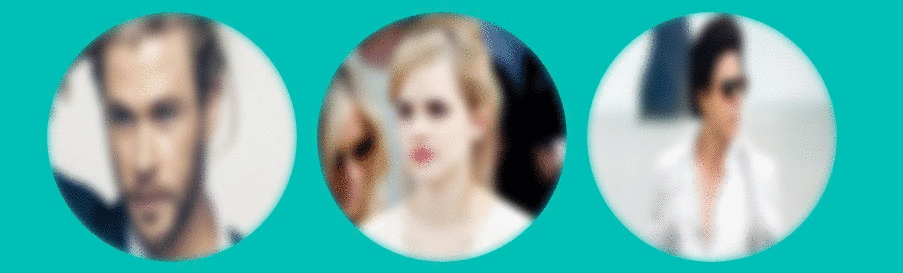
- Style all images with
class:img-4by setting itsblurmethod value to4pxand so that all images withclass:img-4turns into a blur. and add the transition property for the smooth effect..image-holder .img-3 { filter: blur(4px); transition: 0.5s ease-in-out; } - Now on hover, all the images with
class:img-4should turn into the Normal image, to achieve this effect set itsblurmethod value to0.image-holder:hover .img-4 { filter: blur(0); transition: 0.5s ease-in-out; }
check out the demo
See the Pen black and white image hover effect by rajeshdn (@cool_lazyboy) on CodePen.
- CSS Speech bubbles - July 20, 2020
- Simple Button Hover effect – Border Hover effect - October 9, 2017
- Glowing Social icons hover effect - September 11, 2017
Hi. Your Blogs are good, you can post more of Java and of Angular types, though I had read 2 of your Articles like Angular, and one of JSON, but would be looking to your Articles like of Java, or creating a screen through Modal, tooltip etc.
Thanks Kapil, A New article on tooltip will be published soon by Rajesh.