
In this article, I’m going to show you guys how to create the different kinds of speech bubbles. In past creating a speech bubbles was considered as a very difficult task due to the usage of the images in it. but nowadays we can create the speech bubbles very easily by using CSS3 Properties.
Speech bubbles:
Speech bubbles are the very nice way to indicate the content on the web and nowadays the speech bubbles are mostly used in the chat rooms. and we can see the speech bubbles used in the WhatsApp chat box and in many other applications. Speech bubble gives a great and very effective look.
Before jumping into the coding — let me explain the basic concept behind creating an speech bubble, First we need to create a rectangle/box/circle using div element or any other HTML elements and after that we need to incorporate the different shapes of triangles/circles to form the different kinds of the speech bubbles.
lets code
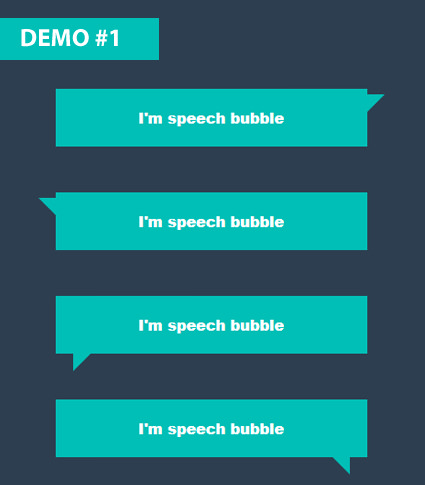
NOTE- Look at the above image, for creating the rectangular speech bubbles, I’m going to use two classes, the common class(class:box) is to create the rectangular box and different classes(class:sb1; class:sb2; class:sb3; class:sb4;) are used for creating different triangles, which are positioned accordingly.
.box {
  width: 300px;
  margin: 50px auto;
  background: #00bfb6;
  padding: 20px;
  text-align: center;
  font-weight: 900;
  color: #fff;
  font-family: arial;
  position:relative;
}
- Start with markup, For creating a simple speech bubble we need a single markup element, here I’m going with div element with two classes in it. one class is for styling the box and one more class is for creating the speech bubble triangle.
/* HTML Structure */
<div class="box sb1">I'm speech bubble</div>
<div class="box sb2">I'm speech bubble</div>
<div class="box sb3">I'm speech bubble</div>
<div class="box sb4">I'm speech bubble</div>
- Check the styling for the
class:boxwhich I’ve mentioned above. - Now style the same div element with
class:sb1( this class is for creating the triangle for speech bubble), here I’m using:beforepseudo element for creating the triangle..sb1:before { content: ""; width: 0px; height: 0px; position: absolute; border-left: 10px solid #00bfb6; border-right: 10px solid transparent; border-top: 10px solid #00bfb6; border-bottom: 10px solid transparent; right: -20px; top: 6px; } - just by changing the top, left, bottom, right properties we can create the different kinds of the speech bubbles in this genre.
See the Pen speech bubbles by rajeshdn (@cool_lazyboy) on CodePen.
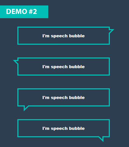
NOTE- Look at the above image, for creating the rectangular speech bubbles, I’m going to use two classes, the common class(class:box1) is to create the rectangular box and different classes(class:sb5; class:sb6; class:sb7; class:sb8;)are used for creating different triangles, which are positioned accordingly.
.box1 {
  width: 300px;
  margin: 50px auto;
  border: 4px solid #00bfb6;
  padding: 20px;
  text-align: center;
  font-weight: 900;
  color: #00bfb6;
  font-family: arial;
  position: relative;
}
- Start with markup, For creating a simple speech bubble we need a single markup element, here I’m going with div element with two classes in it. one class is for styling the box and one more class is for creating two triangles.
/* HTML Structure */
<div class="box1 sb5">I'm speech bubble</div>
<div class="box1 sb6">I'm speech bubble</div>
<div class="box1 sb7">I'm speech bubble</div>
<div class="box1 sb8">I'm speech bubble</div>
- Check the styling for the
class:box1which I’ve mentioned above. - Now here we need a two triangles, where one triangle will overlay on other triangle. for achieving this effect, I’m going with
:after:beforepseudo elements. Now style the same div element withclass:sb5( this class is for creating the triangles for speech bubbles). - I’m using
:beforepseudo element for creating the one triangle..sb5:before { content: ""; width: 0px; height: 0px; position: absolute; border-left: 10px solid #00bfb6; border-right: 10px solid transparent; border-top: 10px solid #00bfb6; border-bottom: 10px solid transparent; right: -20px; top: 6px; } - Now I’m using :after pseudo element for creating one more triangle and by adjusting the
top,rightproperties we can overlay this triangle on other triangle. and by given white border-colorborder-left: 7px solid #fff;border-top: 7px solid #fff;we can achieve the effect which we can see in above image..sb5:after { content: ""; width: 0px; height: 0px; position: absolute; border-left: 7px solid #fff; border-right: 7px solid transparent; border-top: 7px solid #fff; border-bottom: 7px solid transparent; right: -11px; top: 10px; } - just by changing the top, left, bottom, right properties we can create the different kinds of the speech bubbles in this genre.
See the Pen BWxggN by rajeshdn (@cool_lazyboy) on CodePen.
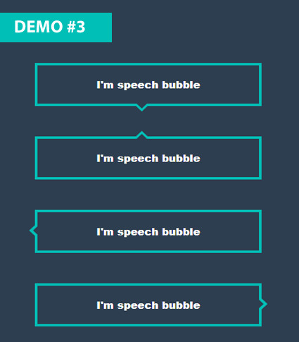
NOTE- Look at the above image, for creating the rectangular speech bubbles, I’m going to use two classes, the common class(class:box2) is to create the rectangular box and different classes(class:sb9; class:sb10; class:sb11; class:sb12;)are used for creating different triangles, which are positioned accordingly.
.box2 {
  width: 300px;
  margin: 50px auto;
  border: 4px solid #00bfb6;
  padding: 20px;
  text-align: center;
  font-weight: 900;
  color: #00bfb6;
  font-family: arial;
  position: relative;
}
- Start with markup, For creating a simple speech bubble we need a single markup element, here I’m going with div element with two classes in it. one class is for styling the box and one more class is for creating two triangles.
/* HTML Structure */
<div class="box2 sb9">I'm speech bubble</div>
<div class="box2 sb10">I'm speech bubble</div>
<div class="box2 sb11">I'm speech bubble</div>
<div class="box2 sb12">I'm speech bubble</div>
- Check the styling for the
class:box2which I’ve mentioned above. - Now here we need a two triangles, where one triangle will overlay on other triangle. for achieving this effect, I’m going with
:after:beforepseudo elements. Now style the same div element withclass:sb9( this class is for creating the triangles for speech bubbles). - I’m using
:beforepseudo element for creating the one triangle..sb9:before { content: ""; width: 0px; height: 0px; position: absolute; border-left: 10px solid transparent; border-right: 10px solid transparent; border-top: 10px solid #00bfb6; border-bottom: 10px solid transparent; right: 50%; bottom: -23px; } - Now I’m using :after pseudo element for creating one more triangle and by adjusting the
bottom,rightproperties we can overlay this triangle on other triangle. and by given white border-colorborder-top: 10px solid #fff;we can achieve the effect which we can see in above image..sb9:after { content: ""; width: 0px; height: 0px; position: absolute; border-left: 10px solid transparent; border-right: 10px solid transparent; border-top: 10px solid #fff; border-bottom: 10px solid transparent; right: 50%; bottom: -18px; } - just by changing the top, left, bottom, right properties we can create the different kinds of the speech bubbles in this genre.
See the Pen speech bubbles 1 by rajeshdn (@cool_lazyboy) on CodePen.

Have a look at the above image, for creating the above rectangular speech bubbles, Just go through my first demo in this article and in addition to that we need to add the border-radius property to a rectangular box that’s it.
See the Pen speech bubbles 3 by rajeshdn (@cool_lazyboy) on CodePen.
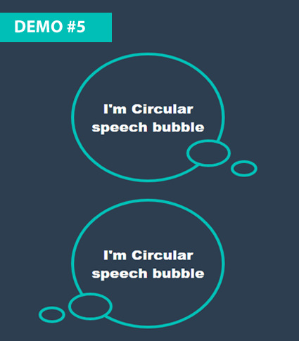
- Look at the above image, for creating the Circular speech bubbles, I’m going to consider a div element with
class:circular-sband two more div elements inside the parent div element./* HTML Structure */ <div class="circular-sb"> I'm Circular speech bubble <div class="circle1"></div> <div class="circle2"></div> </div> <div class="circular-sb"> I'm Circular speech bubble <div class="circle3"></div> <div class="circle4"></div> </div>
- Now style the parent div element with
class:circular-sb, this is the larger circle with content in it..circular-sb { width: 250px; border: 5px solid #00bfb6; padding: 80px 0px; margin: 30px auto; border-radius: 50%; text-align: center; font-size: 24px; font-weight: 900; font-family: arial; position: relative; color: #00bfb6; } - Now here we need a total of three circles, which we are going to incorporate into the parent circle. which we can see clearly in the above image. first we need to style the child div element with
class:circle1and then use the:beforepseudo-element to get the above effect by overlaying the pseudo element on it. and by usingtop, right, left, bottomproperties we can place the child circles where ever we want in the parent element..circle1 { border: 5px solid #00bfb6; position: absolute; width: 25px; padding: 20px; border-radius: 50%; right: -15px; bottom: 23px; } .circle1:before { content: ""; position: absolute; width: 25px; padding: 20px; border-radius: 50%; right: 0px; bottom: 0px; background: #fff; } - Now style the child div element with
class:circle2.circle2 { border: 5px solid #00bfb6; position: absolute; width: 5px; padding: 10px 15px; border-radius: 50%; right: -60px; bottom: 5px; } - Follow the above steps and we can create many different circular speech bubble.
See the Pen circular speech bubbles by rajeshdn (@cool_lazyboy) on CodePen.
Check out the below demo, In which I’ve created few more different kinds of speech bubbles.
See the Pen different speech bubbles by rajeshdn (@cool_lazyboy) on CodePen.
- CSS Speech bubbles - July 20, 2020
- Simple Button Hover effect – Border Hover effect - October 9, 2017
- Glowing Social icons hover effect - September 11, 2017
awesome!thanks for share.
thanks for this job , I’m going to use it now .
Thank you.
This is a very clever and easy solution, many thanks!