
Checkout this amazing 3d shine effect on hover made using plain simple CSS
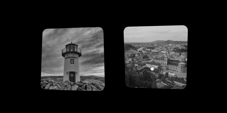
This effect is achieved using perspective transforms and mask
Initially, the images are set with a specific perspective transform and gradient mask position in a way that it is hidden.
The transform rotate value and the mask’s position are changed on hover and they are auto-animated with the transition property.
Read more about Perspective and Mask in CSS
Checkout the full source code below
Also, read 5 easy ways to center an element with CSS
A CA- by education, self taught coder by passion, loves to explore new technologies and believes in learn by doing.
Latest posts by Ranjith kumar (see all)
- Ultimate Guide: Build A Mobile E-commerce App With React Native And Medusa.js - February 15, 2025
- Flutter lookup failed in @fields error (solved) - July 14, 2023
- Free open source alternative to Notion along with AI - July 13, 2023