
In this tutorial we are going to explore, how to create a simple Button background sliding animation effect. Whenever mouse pointer hovers over the button, we can see clearly the background sliding effects, which are Sliding from different directions. It’s very easy and simple to create these effects.
To master these button hover effects, All we need is to understand the few basic CSS Concepts. In which one is the CSS Positions(Relative and Absolute) and other being the CSS Before pseudo-element.
A small snippets about CSS Position and Pseudo-element properties.
CSS Positions
position: relative;
The element is positioned relative to its own position.
position: absolute
The element is positioned relative to its parent element(here parent elements position should be relative).
Before and After Pseudo-elements
What are the use of before and after pseudo-elements?
With the help of before and after pseudo-elements, we can insert the content, before and after any element without adding any elements to the Document Structure.
HTML Structure
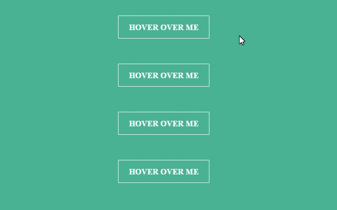
Consider a div element with class:wrapper and inside that div element, consider four div elements with two different classes, In which one being common class(btn) for all buttons and other class(btn-1, btn-2, btn-3, btn-4) being different. common class is used to style the common stylings for all buttons and different classes are used to place sliders in right position. and within all buttons consider the text.
<div class="wrapper">
  <div class="btn btn-1">
    <p>Hover over me</p>
  </div>

  <div class="btn btn-2">
    <p>Hover over me</p>
  </div>

  <div class="btn btn-3">
    <p>Hover over me</p>
  </div>

  <div class="btn btn-4">
    <p>Hover over me</p>
  </div>
</div>
CSS Structure
-
Let’s style the wrapper div in such a way that, it should always be at the center of the browser. by setting its
positionvalue toabsolute,topandleftvalues to50%and by using translate method of transform property, place the wrapper div exactly in the center of the browser..wrapper{ position: absolute; top: 50%; left: 50%; width: 550px; transform: translate(-50%,-50%); } -
By Using common class
class:btnstyle the basic things, by setting its width value to200px, height and line-height(To vertically center the text) values to50px, top and bottom values of the margin to30pxand position value torelativeand transition value for smooth animation effect..btn{ width: 200px; height: 50px; line-height: 50px; border: 2px solid #fff; margin: 30px 0; position: relative; cursor: pointer; transition: all 1s ease; } -
Now style the text inside the div elements, By making the text bold, uppercase and center. and set its position value to
relativeand z-index value to1(higher value)so that the text would be above all elements, whenever we hover over the div elements..btn > p { text-align: center; text-transform: uppercase; color: #fff; font-weight: bold; font-size: 16px; position: relative; z-index: 1; transition: all 1s ease; } -
Using Before pseudo-element we can create the sliders, By setting its width and height values to
100%as equal to its parent element. and position value toabsolute..btn:before{ content: ""; width: 100%; height: 100%; background-color: #fff; position: absolute; transition: all 1s ease; } -
Use the
top and leftproperties and different classes(btn-1, btn-2, btn-3, btn-4)of the div elements and place sliders in different positions./* Top Slider */ .btn-1:before{ top: -60px; left: 0; } /* Left Slider */ .btn-2:before{ top: 0; left: -210px; } /* Right Slider */ .btn-3:before{ top: 0; left: 210px; } /* Bottom Slider */ .btn-4:before{ top: 60px; left: 0; } - Use the
overflow:hiddenproperty to the div elements to hide the sliders..btn{ overflow: hidden; }
Check out the youtube video on Button Hover effect
Hover Effects
.btn-1:hover:before,
.btn-4:hover:before{
        top: 0;
}

.btn-2:hover:before,
.btn-3:hover:before{
        left: 0;
}

.btn:hover p{
        color: #00bfb6;
}
Check out the codepen Demo
See the Pen background sliding animation button by rajeshdn (@cool_lazyboy) on CodePen.
- CSS Speech bubbles - July 20, 2020
- Simple Button Hover effect – Border Hover effect - October 9, 2017
- Glowing Social icons hover effect - September 11, 2017