
Google Images is an example of a responsive photo grid gallery which also opens images with a full preview on tap. Here’s how to create it using flexbox in CSS
Source code
HTML:
<div class="gallery">
<div class="column">
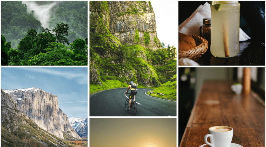
<img src="https://source.unsplash.com/random/800x600/?jungle"/>
<img src="https://source.unsplash.com/random/600x800/?mountain"/>
<img src="https://source.unsplash.com/random/800x600/?beach"/>
<img src="https://source.unsplash.com/random/600x800/?forest"/>
<img src="https://source.unsplash.com/random/800x600/?desert"/>
<img src="https://source.unsplash.com/random/600x800/?pond"/>
</div>
<div class="column">
<img src="https://source.unsplash.com/random/600x800/?bicycle"/>
<img src="https://source.unsplash.com/random/800x600/?airballon"/>
<img src="https://source.unsplash.com/random/600x800/?skate"/>
<img src="https://source.unsplash.com/random/800x600/?scooter"/>
<img src="https://source.unsplash.com/random/600x800/?moto"/>
<img src="https://source.unsplash.com/random/800x600/?car"/>
</div>
<div class="column">
<img src="https://source.unsplash.com/random/800x600/?lemonade"/>
<img src="https://source.unsplash.com/random/600x800/?coffee"/>
<img src="https://source.unsplash.com/random/800x600/?water"/>
<img src="https://source.unsplash.com/random/600x800/?wine"/>
<img src="https://source.unsplash.com/random/800x600/?juice"/>
<img src="https://source.unsplash.com/random/600x800/?beer"/>
</div>
<div class="column">
<img src="https://source.unsplash.com/random/600x800/?office"/>
<img src="https://source.unsplash.com/random/800x600/?bar"/>
<img src="https://source.unsplash.com/random/600x800/?garage"/>
<img src="https://source.unsplash.com/random/800x600/?house"/>
<img src="https://source.unsplash.com/random/600x800/?camping"/>
<img src="https://source.unsplash.com/random/800x600/?store"/>
</div>
</div>
CSS:
* {
	box-sizing: border-box;
	transition: all 0.125s ease 0s;
}

body {
	margin: 0;
	padding: 0;
	background: #fff;
}

body:before, body:after {
	content: "IMAGES FROM UNSPLASH.COM";
	position: absolute;
	top: 0px;
	color: #00000000;
	left: 50%;
	transform: translateX(-50%);
	text-shadow: 0 -1px 1px #000000ab, 0 1px 1px #ffffff82;
	font-family: Arial, serif;
	padding: 2px 10px;
	border-radius: 2px;
	font-size: 9px;
	display: flex;
	align-items: flex-end;
	line-height: 14px;
}

body:after {
	top: inherit;
	bottom: 0;
	position: relative;
	margin-top: -12px;
	transform: translateX(-100%);
	margin-left: 90px;
	width: 150px;
}

img {
	width: 100%;
}

.gallery {
	display: flex;
	padding: 5px;
	flex-wrap: wrap;
}

.column {
	flex: 25%;
	padding: 5px;

}

.column img {
	margin-top: 5px;
	cursor: pointer;
}

.column img:active {
	height: auto;
	width: auto;
	max-width: 80%;
	position: fixed;
	left: 50%;
	top: 50%;
	border: 10px solid #fff;
	margin: 0px;
	box-shadow: 0 0 1000px 1000px #fff8;
	transform: translateX(-50%) translateY(-50%);
}


@media (max-width: 768px) {
	.column {
		flex: 50%;
	}
}

@media (max-width: 500px) {
	.column {
		flex: 100%;
	}
}
Live Demo
See the Pen Responsive Flexbox Photo Gallery – CSS by Josetxu (@josetxu) on CodePen.
A CA- by education, self taught coder by passion, loves to explore new technologies and believes in learn by doing.
Latest posts by Ranjith kumar (see all)
- Ultimate Guide: Build A Mobile E-commerce App With React Native And Medusa.js - February 15, 2025
- Flutter lookup failed in @fields error (solved) - July 14, 2023
- Free open source alternative to Notion along with AI - July 13, 2023